Type of work included in this project – Brand Guidelines, Can Packaging, Stationary Set, Ad Campaign.
Skills Developed – Branding, Logo Design, Partner Collaboration.
‘Branding’ class in CEGEP required us to partner up and build a brand from scratch. After a whole semester of creating different projects for ‘OKombucha’, our kombucha company was ready to be presented at the student ‘Brand Expo’, where we received outstanding feedback. Thanks for partnering up with me Lara!
(Go check her portfolio out! https://larafitzpatrick.com)
Brand Guidelines + Logo
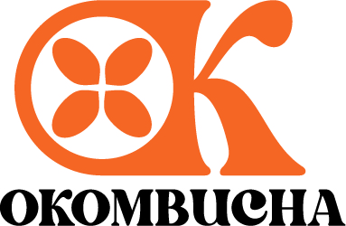
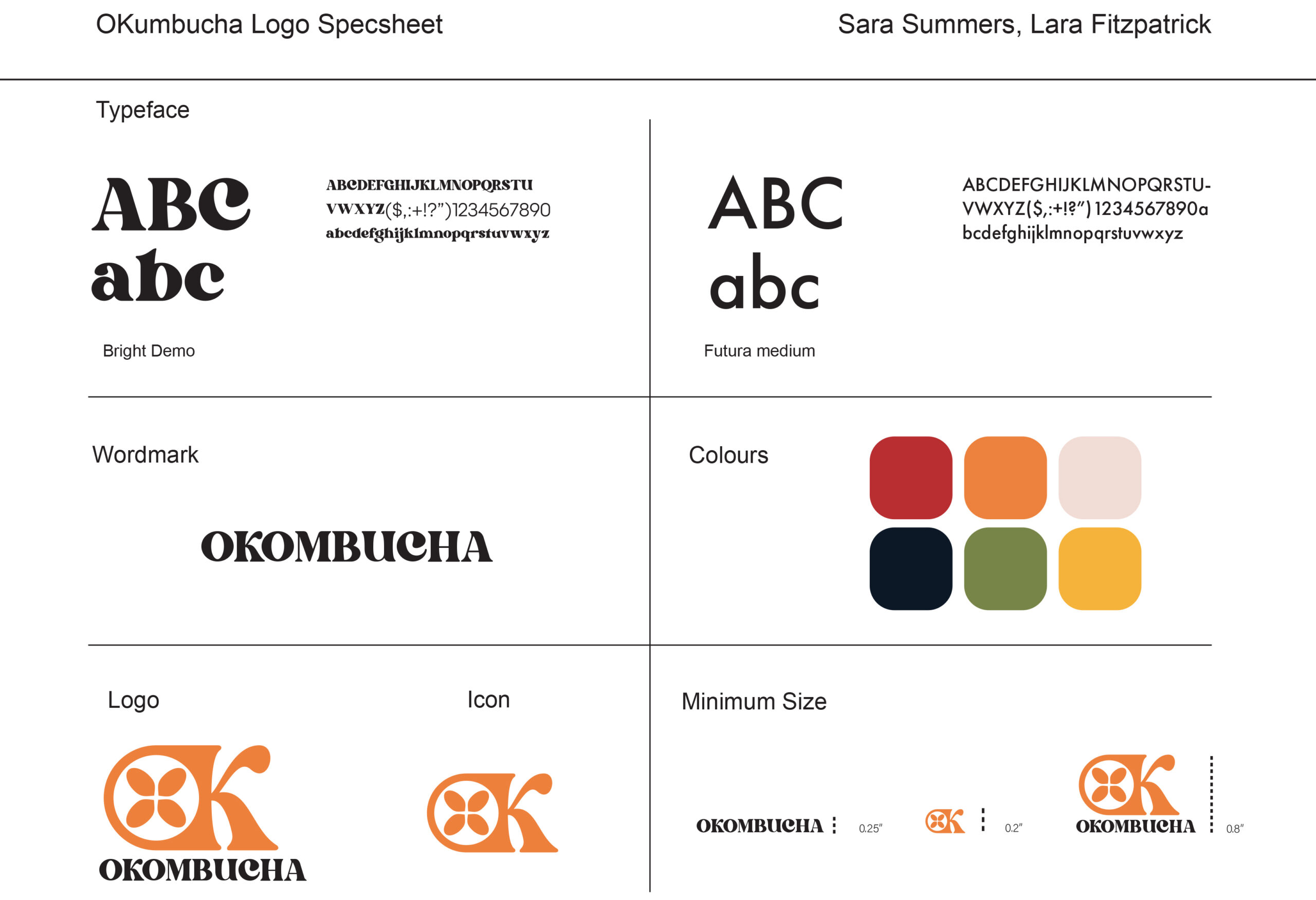
Instead of leaning into the health aspect of the drink, we decided to stand out from the competition. The Logo is fruit-like and bold, using flashy orange and a thick font, while the text font is thinner and straighter for contrast. The colour scheme is vibrant and the visuals 70’s inspired. The ‘OK’ icon is easily recognizable makes you wonder ‘what are we saying OK to ?’. The answer is in OKombucha’s cheeky slogan: “It’s better than great. It’s OK.”
Can Packaging Design
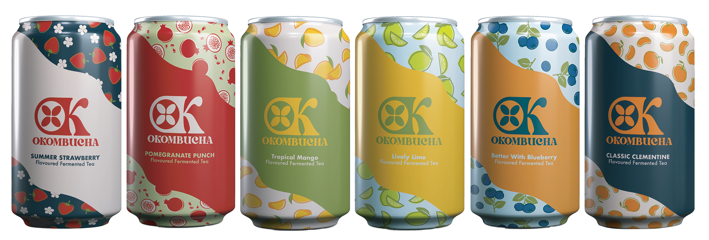
Respects the established colour scheme while be easily distinguishable one from another. Flavours are illustrated in a pattern for even more clarity.
Stationary Set
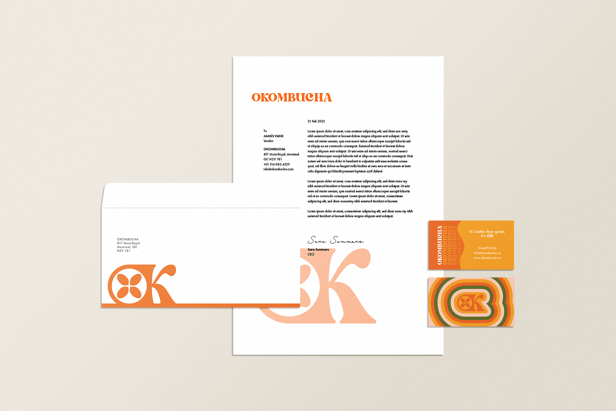
A stationary set must be clean, and professional. Keeping the company feel while not being too distracting.
Ad Campaign
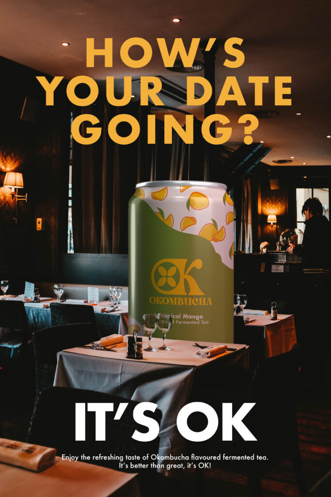
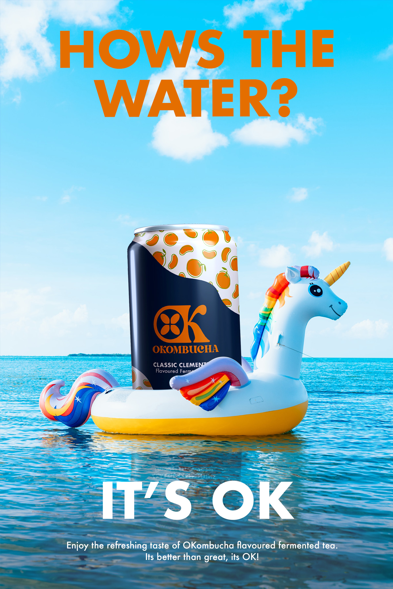
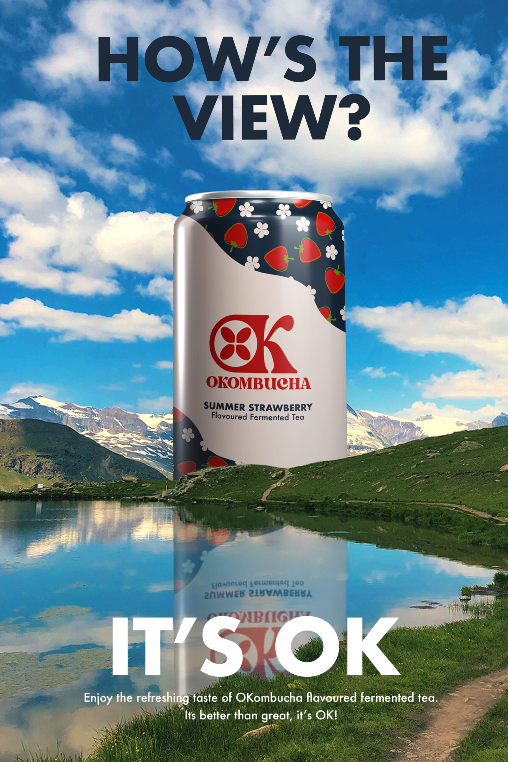
Referencing OKombucha’s playful slogan, this ad campaign answers various questions with “It’s OK”, when the visuals clearly pain a picture of something that is far more than ‘just ok’. The tone and composition of the ads (A giant kombucha can in the center) make the brand memorable and recognizable, all while keeping a consistent theme where new versions can always be added.
